How good does your stuff look?
By stuff, I mean all the images that represent you – on your website, in your logo, in your course, in your presentations, on your Facebook, Instagram, Twitter and all your social media.
Does the message you are sending represent you well? Does it boost your credibility?
(Because if it doesn’t, you could lose those visitors to your website and the potential students in your classes!)
If not, no worries. It’s always something you can improve.
Use these 5 Secrets to improve everything you share online.
Secret #1: Create a Palette of Colors… and Stick to It
Pick a set of 4-5 colors you are going to use and then stick to them.
Coolors.com is a terrific site for finding color schemes that work well.
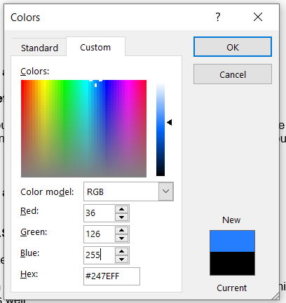
Use the same colors on everything you share. For example, I have a blue in my logo that I try to use whenever possible.
Online there are two ways to represent colors: as RGB codes or as HTML/hex colors. For example, my blue color from my logo is RGB 36 – 126 – 255 and hex color code #247eff.
Use the exact codes in your graphics tools. See how I can set custom colors with the RGB and hex codes in Microsoft Word here? Most programs let you set the colors this way.
Secret #2: It’s All About the White Space and Contrast
Often good design is about how much empty and white space you leave too.
White space gives the eye a break, a place to rest, and it makes the words or text pop out.
Use contrast to your advantage. White vs. black contrasts and make things stand out.
Orange buttons jump off a page – and you want them to stand out and grab attention.
A lot of designers like to make everything look the same, but then you can’t drive attention where you want it.
We use orange buttons on almost everything to grab the viewer’s attention.
Secret #3: Use Fonts Well
The font you choose can make or break the readability of what you are saying.
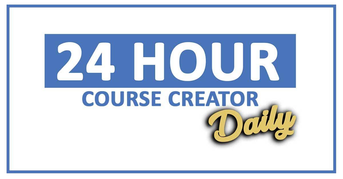
When you combine fonts, make sure you contrast a simple font with a more flowy complex font for the biggest impact (for example in your logo). See how we did this for 24 Hour Course Creator Daily? We have a very plain font with a script font for the word “Daily.”
Always, always use a very readable font for the text on your website and in your email newsletter.
Be careful with italics – they can help you emphasize something, but they can be tough to read.
Some fonts can only be used for commercial purposes when you pay for them, so always check on that. I use Google fonts since they are considered “royalty-free.”
Secret #4: Use Royalty-Free or Paid Photos
Just like fonts, photos can require you to pay to use them.
One of my clients had a photo on her website that she didn’t know was from a paid site. The site’s lawyers contacted her with a $1,000 bill for using the photo without purchasing it!
So always be careful where your photos come from.
You definitely cannot just grab a photo from Google and start using it!
Use royalty-free sites like Pixabay or Unsplash. Or pay for a photo membership like BigStockPhoto, iStockPhoto or DepositPhotos.
Secret #5: Get Feedback & Get Help
The combination of all these principals creates an image for you… for example, black and gold with fancy fonts can be seen as classy and expensive. Blue is seen as calming, soothing color. The Comic Sans font makes me think of elementary school.
What image are you sharing?
After almost 20 years of working with clients, I have realized that most people can either see what good graphic design is or they don’t see it at all.
You either have an eye for it or you don’t.
If you don’t, then you definitely need to get outside advice from graphic designers or tools that make this easier.
Canva is one of those tools that has set up default templates with many of these design principles already included. You don’t have to know about which fonts work together – just use the ones they have put into their templates already.
I will say excellent graphic design is one of those ways that you can definitely make your course stand out from others. In fact, right now there are two websites I would like to share with you because they have good content, but they look like they were created in 1995, and I won’t share them because of it. They look old and out-of-date, even though their content is not.
So use these 5 secrets to step up your design and increase your crediblity and your image. Tiny changes can make a huge difference!
Now Take Action…
What If You Had Unlimited Graphic Design?
One of my secret weapons is my design team where I have access to unlimited design projects. And you can too – at an amazing discount!
The Kapa99 team has been terrific at helping me with lots of projects since I started with them last November. Here is a list of just a few of the projects they can do for you:
- Blog images
- Social media images
- Powerpoint presentations
- Ebook/lead magnet layout
- Infographics
- Course graphics
You do need to be very specific about what you want – including reminding them of your branding details and giving examples of what “look” you like. I have been impressed that they come up with designs I never would have thought of!
Typically their unlimited design projects are $399/month. But I have worked out a special VIP offer for you as a subscriber, and you can work with them for only $249/month!
Imagine having all your course graphics and your presentations created by someone else… it would really take the pressure off finishing your course.
Or if you had your marketing and social media graphics done for you!
To get the special offer, go through this link and enter your information. The team will get back to you within a day or two. (Don’t go to the regular website. You won’t get the discount VIP pricing. That’s just for my community.)
https://coursecreatorshq.com/kapa99-special
Top Tool: Snappa
If you instead need to do DIY graphic design, consider jumping into Snappa.
We shared our 5 favorite features here.
(My favorite has to be the one-click resizing so you can create an image for Twitter and then easily resize it for Instagram, Facebook, Instagram Stories, LinkedIn… with just a click.)